A/B Testing with Boei: Optimize Your Lead Generation Strategy
At Boei, we understand that every interaction matters, and sometimes even the smallest change can make a significant difference. That's why we offer easy A/B testing capabilities right within your dashboard.
In this article, we show you how this works.
Setting up tests
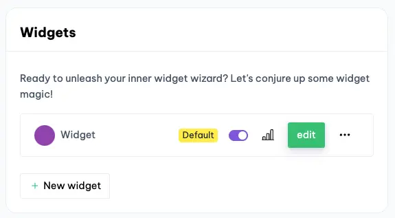
Suppose you now have one widget on your website. This is now shown on every page. You want to A/B test a different background color.
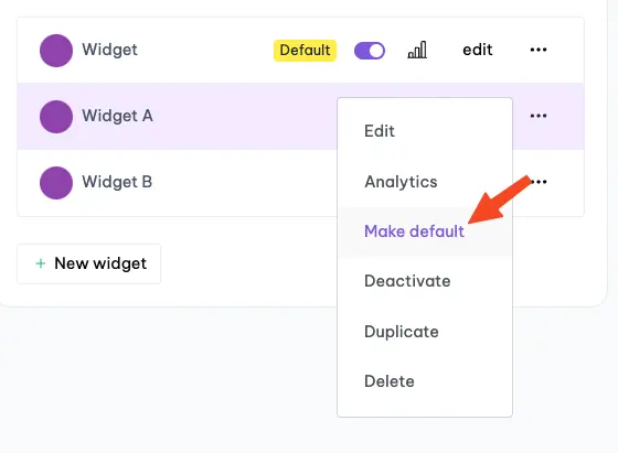
First, create two duplicates of the existing widget.
Next, rename one duplicate to Widget A and the other to Widget B (click the name twice to rename it). Don't rename the original widget because we want to capture new data.
For our A/B test, we'll run Widget A in the first week and Widget B in the second week.
When week 1 kicks off, set Widget A as the default widget.
Repeat this process after one week, but make Widget B the default this time.
Analyzing results
After two weeks we can see the results.
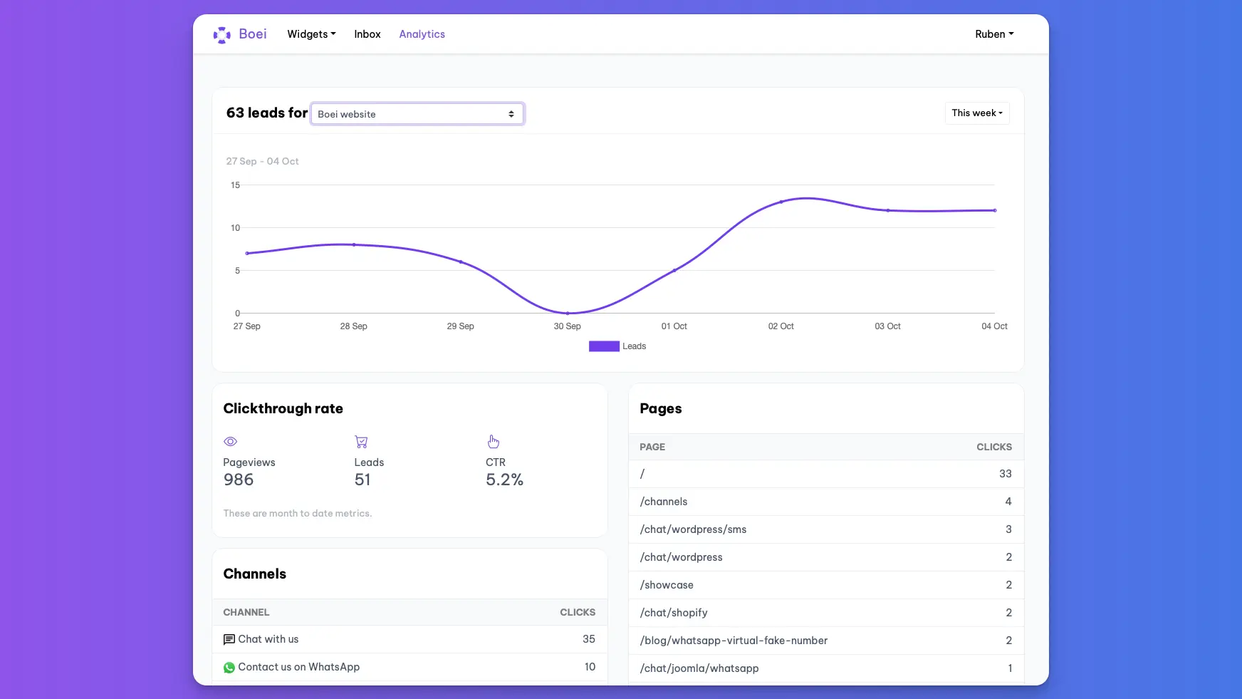
We can go to Boei Analytics dashboard.
We can select the desired widget at the top on the select box.
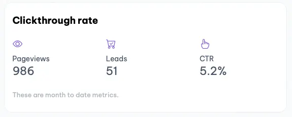
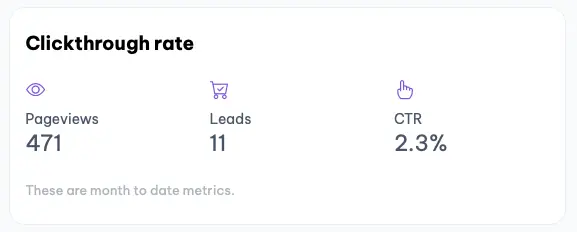
Now let's open each widget and compare the Click through rates.
Widget A
Widget B
Results analysis
While Widget A garnered more pageviews, that's not the metric that should capture our attention. What really counts here is the Click-Through Rate (CTR).
In comparing the two, Widget A's CTR almost doubles that of its counterpart.
So, it's clear: Widget A takes the crown as the winner!
Now we set that widget as the default and watch those leads roll in! 🎉
